What is Prism?
Prism is the design token engine that bridges the gap between Figma and your codebase. It empowers teams to build with a Single Source of Truth for styles, variables, and themes.
Figma Direct Sync
Unlike simple exports, Prism deeply integrates with Figma's Variables and Styles APIs to maintain context, aliases, and modes.
Code Integration
Automatically generate high-performance CSS, Tailwind configurations, and TypeScript interfaces that stay in sync with design.
The Philosophy
We believe that design systems are living software, not static files. Prism eliminates the manual handoff of "Hex codes in Slack" by turning design decisions into typed, versioned code variables instantly accessible to engineers.
Token Dashboard
The Dashboard is the central command center for your entire design-to-code infrastructure. It provides a real-time bridge between your Figma source of truth and your production environments.
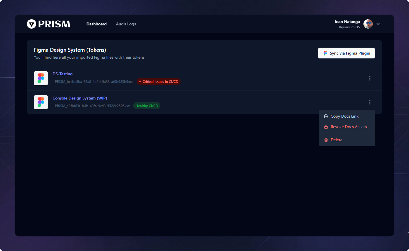
Figma Plugin Synchronization
Prism acts as a perpetual bridge to Figma. Simply open the Prism Figma Plugin to push your Variables and Styles directly to the dashboard. Every sync triggers an automated validation process, ensuring your design system remains consistent across all files.
Permanent Health-Check
Integrated directly into your CI/CD pipeline, every design system file is constantly monitored. Prism flags semantic errors, broken aliases, or unbound styles before they ever reach production.
Contextual Operations
Access advanced options via the 3-dots menu for each system. From here, you can instantly Publish Documentation (or revoke access) and even delete the design system file sync.
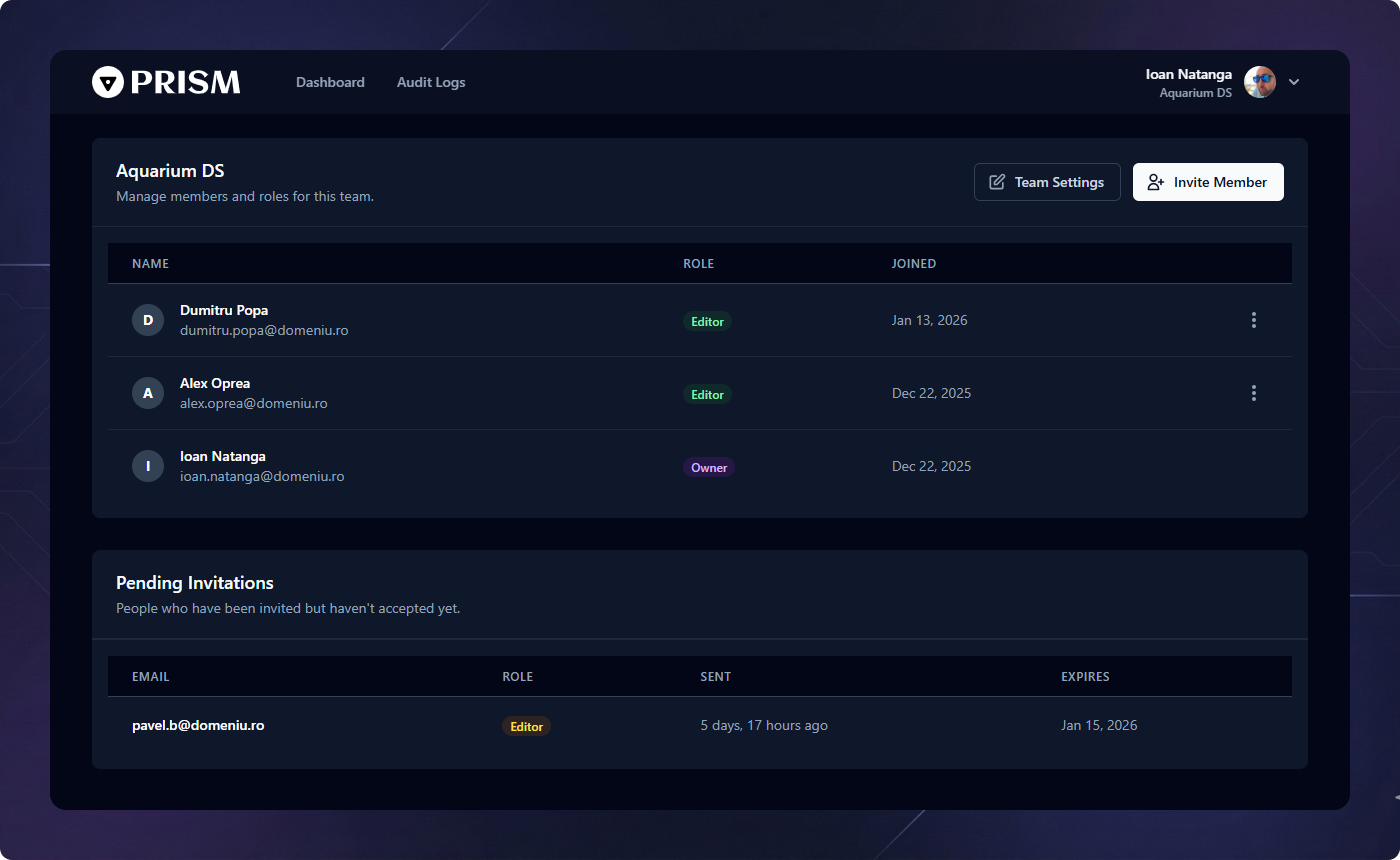
Team Management
Collaborate with ease. Prism's team management tools allow you to scale your design operations by inviting contributors and customizing your public presence.
Identity & Branding
Set your Team Name to reflect your organization or department. This identity is used across the platform to group design systems and provide context for all collaborators.
Inviting Collaborators
Expand your team by inviting engineers, designers, and stakeholders to the platform. Manage access levels and ensure everyone has visibility into the latest design automated assets and live documentation.
Custom Sub-Domain
Take ownership of your documentation. Configure a Custom Sub-domain
(e.g., brand-docs.prismtokens.app) to host your public design system
documentation, providing a professional and branded gateway for your entire
technical team.
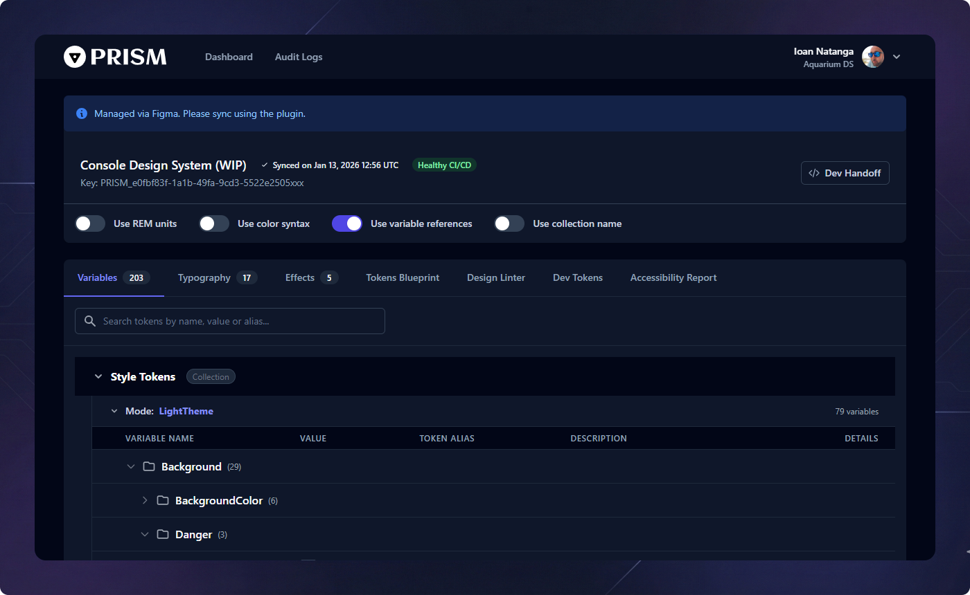
Tokens: Variables
Figma Variables are the core of modern design systems. Prism supports all variable types—Numbers, Strings, and Booleans—while maintaining their collection structure and mode-specific values.
Usage in Prism
Variables are primarily used for structural design decisions like spacing scales (e.g.,
--spacing-md) and component toggles. When you sync from Figma, Prism preserves
the logical groups (Collections) you've created.
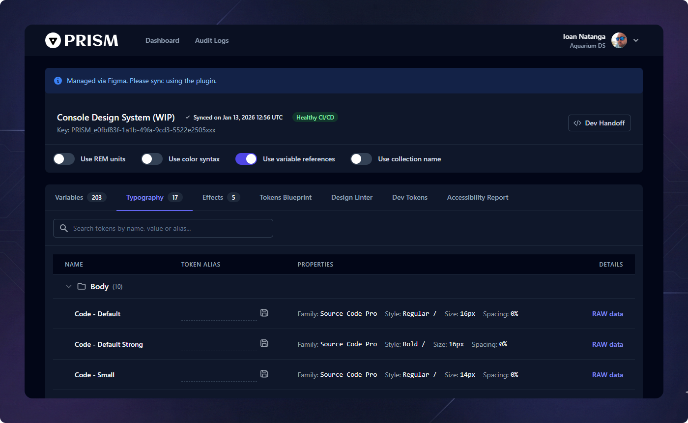
Tokens: Typography
Prism extracts full typography style definitions from Figma, including font family, size, weight, line-height, and letter-spacing.
Implementation
Typography tokens are exported as comprehensive code snippets, making it easy to implement consistent text styles across web, iOS, and Android platforms.
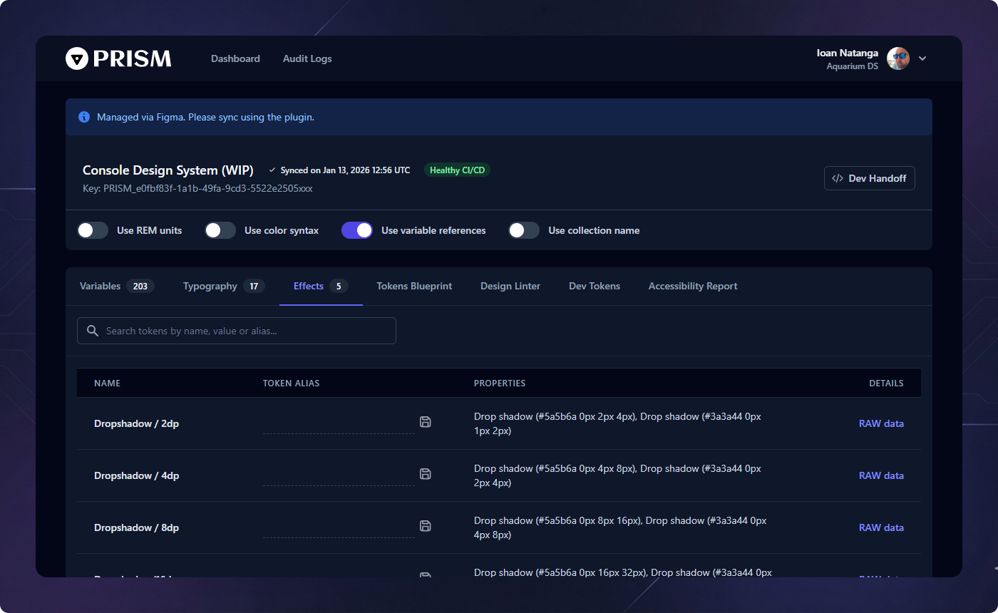
Tokens: Effects
Layer effects like shadows and blurs are captured as first-class tokens. These are often the hardest to keep consistent across platforms, but Prism automates the translation.
Shadow Support
Prism handles multiple shadow layers per token, exporting them as CSS filter strings or platform-specific elevation models.
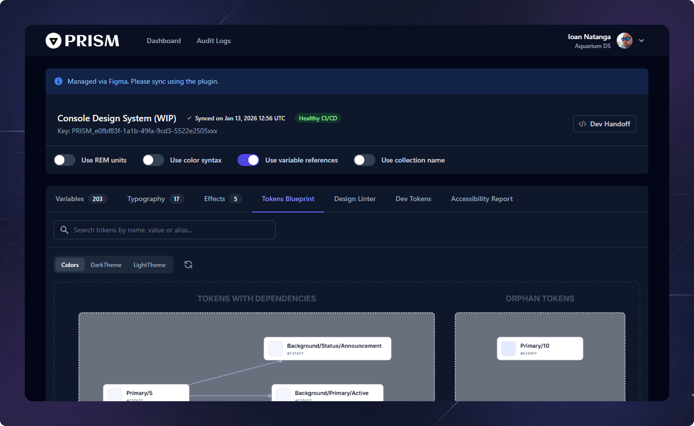
Tokens Blueprint
The Blueprint is an interactive visualization of your design system's architecture. It maps the flow of design decisions from core primitives to platform-specific tokens.
Why it matters
It allows teams to "see" the impact of a change. Changing a core primary blue will show every component and semantic token that is influenced by that single decision.
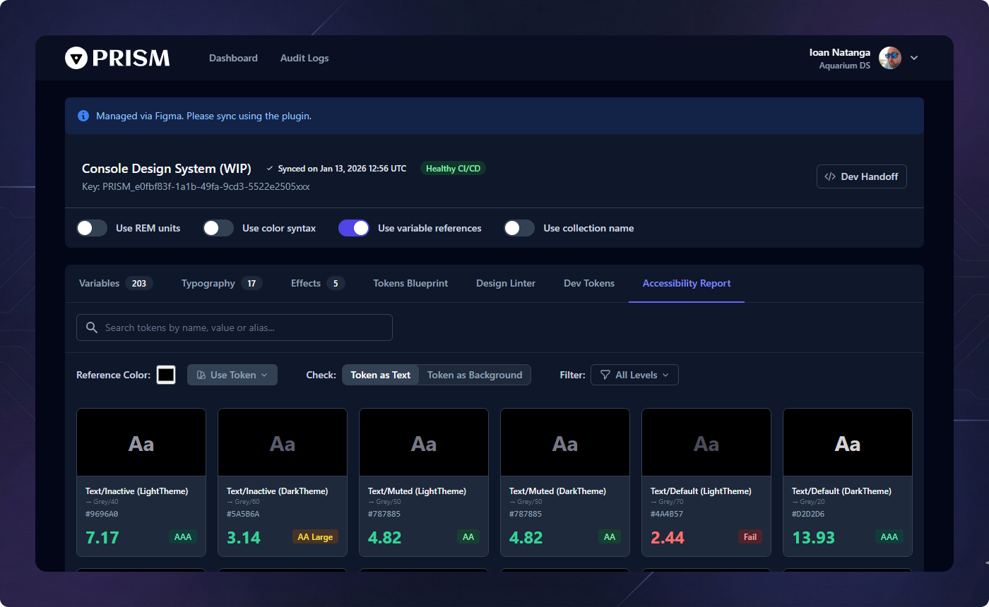
Accessibility & Contrast
Inclusivity is baked into Prism. The Accessibility tab runs automated contrast checks on your color pairings to ensure your product remains WCAG compliant.
Compliance Reports
Identify failing contrast ratios before code ever reaches production. Prism flags problematic pairings in your semantic tokens based on AA and AAA standards.
Design Linter & Health
The Design Linter protects the integrity of your token system. It scans your collections for inconsistencies and bloat that can slow down both design and development.
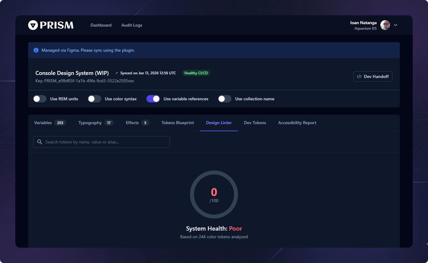
Hardcoded Semantics
Identifies semantic tokens that link directly to raw values (hex, pixels) instead of referencing a core primitive. This ensures your theme remains fully swappable and maintainable.
Visual Clutter
Detects colors that are visually identical (DeltaE < 3) but have different names, suggesting potential merges to simplify the system.
Exact Duplicates
Flags tokens sharing the exact same value. This helps in identifying where primitives might be incorrectly used directly instead of referencing a shared constant.
Snippet Generator
The Snippet Generator is the developer's best friend. It provides instant access to code for any token in multiple formats including CSS, SCSS, JavaScript, Swift, and Compose.
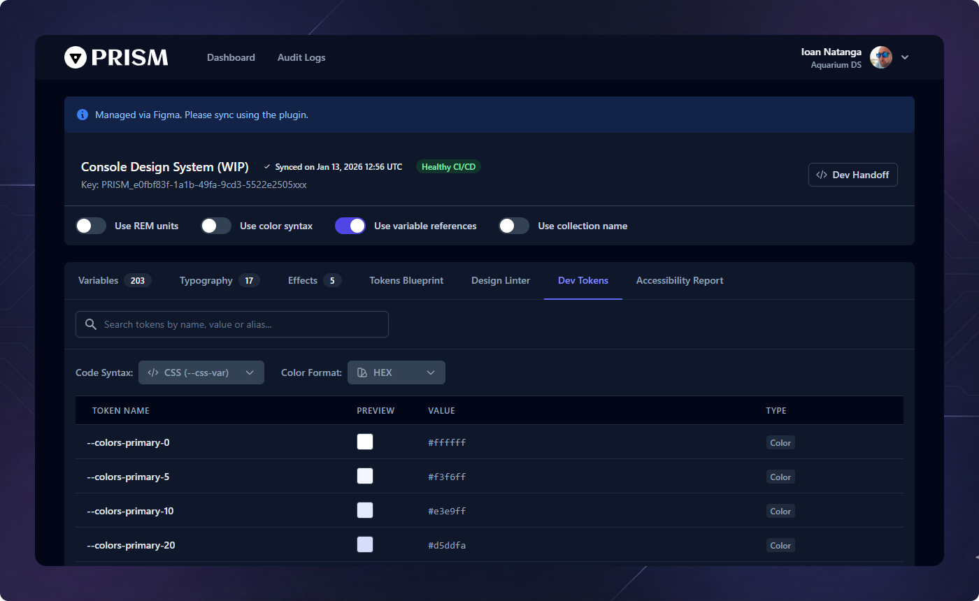
Format Switching
Automatically convert color tokens between HEX, RGB, and the ultra-performant OKLCH format for modern web standards accurately and instantly.
Direct Downloads
Download production-ready .json and
.css files directly from the dashboard for immediate local development
integration.
TypeScript Support
For front-end engineers, Prism generates a specialized TypeScript Declaration (.d.ts) file. Integrate this into your IDE to get full autocompletion and type-safety for your design tokens.
Export & Deployment
Prism supports multiple ways to get your tokens into your product. From manual JSON downloads to automated CI/CD pipelines via our secure API endpoints.
Global Export Configuration
Customize how your tokens are processed before they hit your codebase. Prism provides granular control over the output format:
Use REM units
Automatically converts pixel values to relative REM units based on your system's base font size (default 16px).
Use Color Syntax
Switch the global output format between modern OKLCH or traditional HEX/RGB across all generated assets to match your project's technical requirements.
Use Variable References
Decide whether your output should include raw
values or maintain the alias relationships (e.g., var(--primary-bg)
pointing to var(--blue-500)) for a truly dynamic system.
Use Collection Name
Optionally include the Figma Collection name as a prefix or grouping key in your JSON/CSS output to maintain organizational parity with your design files.
Handoff & CI/CD
Automate your design system delivery. Prism provides a suite of tools and snippets to ensure your production code always stays perfectly in sync with your Figma definitions.
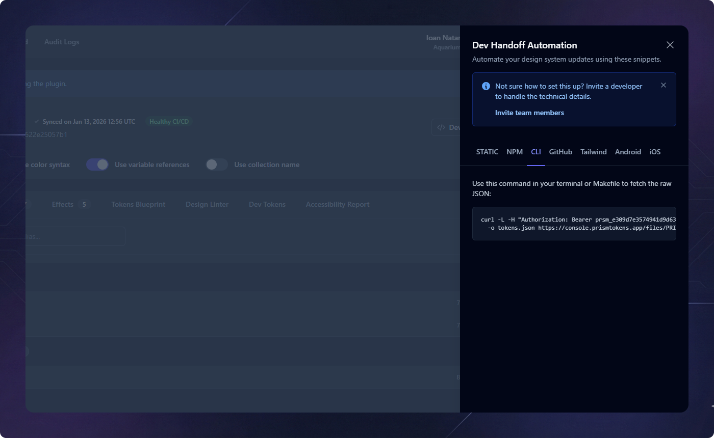
NPM & Terminal Integration
Integrate token syncing directly into your development workflow. By adding a simple
curl command to your package.json, developers can update
the entire design system with a single command: npm run tokens:sync.
Cloud Automation (GitHub Actions)
Remove human intervention entirely. Add Prism to your GitHub Actions workflows to automatically fetch the latest tokens during your build process. Combined with our secure API keys, your CI/CD pipeline becomes the true source of truth.
Native Adapters
Prism isn't just for web. Export production-ready code for Android (XML) and iOS (Swift), ensuring cross-platform visual consistency without mapping errors.
Platform Endpoints
- JSON (variables support)
- CSS (variables support)
- Tailwind JS Config
- TypeScript Definitions
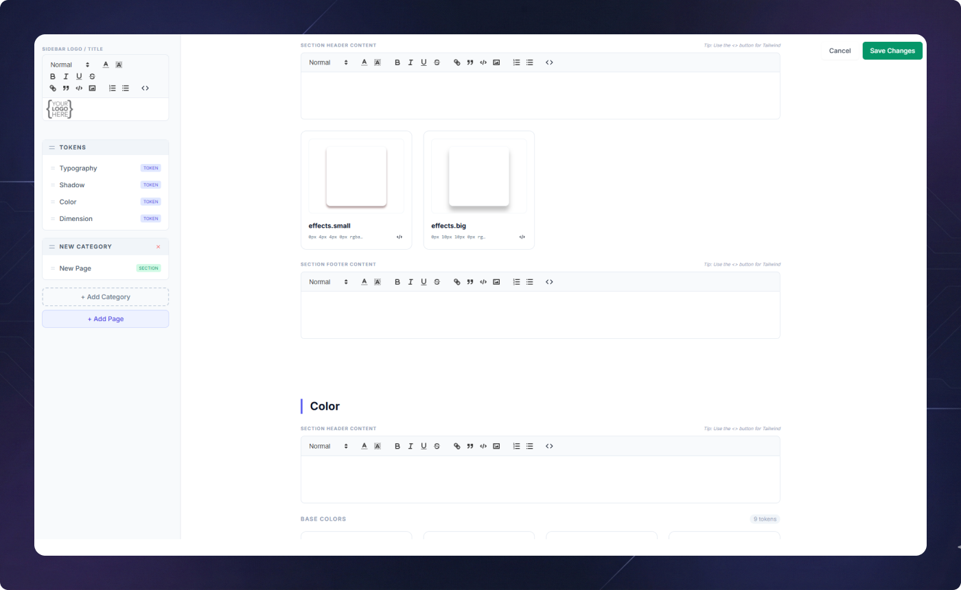
Living Documentation (CMS)
Turn your design tokens into a professional documentation site. The CMS Builder allows you to create custom sections to explain how and why tokens should be used.
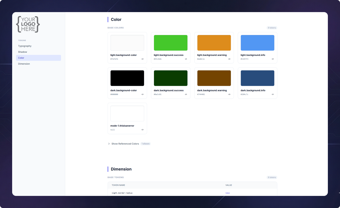
Interactive Editor
Add rich text, images, and live token previews with ease. The visual navigator allows you to organize your documentation structure using intuitive drag-and-drop actions.